Where AI and human judgement work together. A scalable way to categorise products without taking judgement away from the people who know them best.
AI & AutomationOperationsRetail Tech
01 / The assignment
Overview
With Marketplace approaching, Tesco's manual process could not keep up with the products it already had to categorise.
The launch would add millions of third-party listings. Products placed in the wrong category were harder to find through search and navigation. As Lead UX Designer in a five-person core team, I led the design of a system that categorised clear cases automatically and gave Online Operations colleagues the uncertain ones to review.
We shipped the MVP in six months, before Marketplace went live.
02 / The constraint
Understanding the problem
The manual process was already asking too much of the colleagues who kept product categorisation moving.
Even experienced Online Operations colleagues could categorise around 100 products a day alongside their other work, while more than 10,000 products arrived each week across Tesco's digital channels. Supplier descriptions were often incomplete or inconsistent, and some products could fit several categories. Colleagues had to work through that ambiguity as well as the volume.
To understand where the pressure sat, we followed products from their arrival in Tesco's systems through to Tesco.com and watched colleagues work. They described repetitive effort, difficult decisions and little feedback on their progress. With Marketplace approaching, hiring more reviewers would be costly and still would not keep pace with incoming products, either before launch or once Marketplace was live.
Discovery themes from stakeholder and colleague sessions.
Themes and areas of disagreement from the research.
Operational needs and feedback captured during discovery.
03 / The design process
Designing the handoff between AI and colleagues
We traced the existing process and tested ideas with real product data, returning to earlier decisions as we learnt more from colleagues.
01
Trace the work
Following products from arrival to Tesco.com showed where they passed between teams and where colleagues had to make judgement calls.
Stakeholder research
Service blueprinting
Workflow observation
02
Examine the data
Real product data showed which matches were clear and which still needed colleague judgement because descriptions were incomplete or several categories seemed plausible.
Product data analysis
Data modelling
Automation assessment
03
Map the handoff
The handoff had to let colleagues accept a good match or correct a bad one with enough context to decide. I worked through those decisions with product and engineering before shaping the interface.
Review flows
Edge-case mapping
Wireframing
04
Test real workload
Realistic product volume exposed where review would become slow or repetitive, and colleague feedback guided each revision.
Real-data prototyping
Moderated usability testing
Iterative refinement
05
Deliver in phases
Filtering slipped from the MVP. We made the trade-off and follow-up delivery date explicit, then shipped the feature three weeks later.
Priority scoring
Delivery planning
Phased release
04 / The approach
Giving people the difficult decisions
AI categorised clear matches automatically. Colleagues reviewed products where the right category was uncertain.
The review workspace put that handoff into practice. Colleagues could approve, reject or remap AI suggestions, and their corrections fed back into the model.
System model
A conceptual view of the system layers, with colleague judgement between AI categorisation and the customer experience.
Step 5 of 5
Design principles
The review workspace needed to help colleagues make informed decisions, handle volume and pass corrections back into the system.
See the full picture
Put product details, the AI suggestion and the taxonomy in one view, so colleagues could judge a match without searching across screens.
Keep colleagues in control
Give reviewers clear ways to approve, reject or remap a suggestion when the proposed category was wrong.
Make review manageable at scale
Use batch actions for repeated decisions, with a route into detailed review for products that needed closer judgement.
Learn from corrections
Capture corrected mappings and feed them back into the model to improve future suggestions.
05 / The review experience
From queue to decision
The MVP let colleagues start with the workload, act together on routine products, or inspect an uncertain category in detail. The screens below span the MVP, later releases and tested concepts, not one before-and-after build.
MVP / Queue overview
See what needs attention
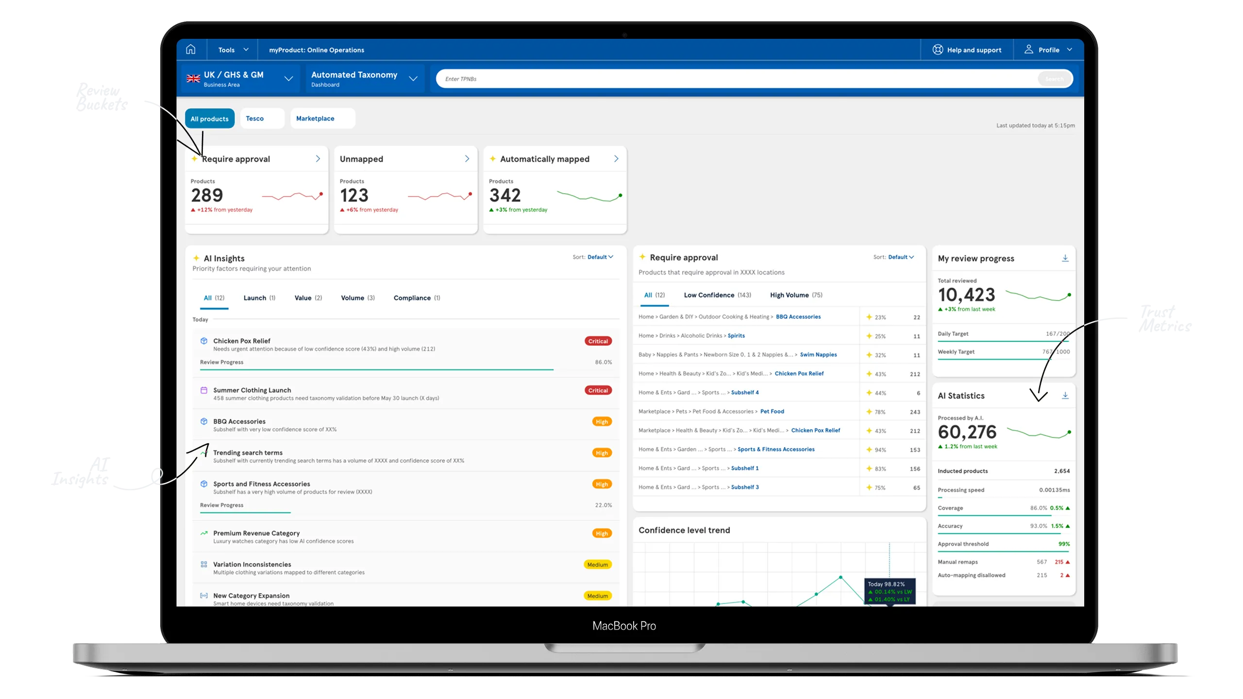
The queue overview grouped work into Automatically mapped, Require approval and Unmapped buckets, with counters and trends showing where review was needed before opening a product.
Review buckets. What needs attention, at a glance.
MVP / Bulk review
Clear repeated decisions
In the categorisation table, colleagues selected products with checkboxes and used a floating action button to approve, remap or reject them together. The separate location browser pictured below shipped later.
Product mapping. Browse category assignments and select products for review.Location browser. Browse taxonomy branches to narrow the product list.Bulk selection. Selected rows surface a floating action control.
MVP / Detailed review
Examine one product
The three-pane Inspector kept product details, the AI suggestion and a taxonomy tree together. Colleagues could drag locations into place and sort their priority. The scores shown below came later; variant views were designed and tested.
Inspector. Product details, AI suggestions and taxonomy paths appear together.Suggestion pane. Approve or reject proposed taxonomy locations beside the AI suggestions.
After the MVP
More ways to focus the work
Filtering shipped three weeks later and the fuller dashboard eight weeks later. Other later-shipped tools included a separate taxonomy browser for scoped review, filters including proposition, location and confidence score, and quick lists. AI insights and richer review and performance metrics were designed and tested, but are not all confirmed as shipped.
AI insights. Sort review priorities by launch, value, volume or compliance.Review and AI metrics. Track colleague progress alongside model processing and accuracy.Dashboard. Queues, priorities and progress in one view.
Dashboard concept. An illustrative view of review queues, insights and performance measures; the figures shown are not the launch results.
06 / The outcome
Impact & reflection
The system went live across Tesco's online propositions before Marketplace launched, and the AI earned its place beside the people who reviewed its work.
The hardest part of this project was never the technology. It was keeping the AI clearly helpful without making the colleagues who ran the established manual process feel replaced by it. Everything we designed carried that balance: plain status cues instead of confident-sounding numbers, batch actions that took the repetitive work off their desks, and a review loop in which their corrections changed what the AI suggested next.
Colleagues started as sceptics. They had built a way of working that kept products categorised for years, and doubted a machine could take on the parts they knew best. We answered that with evidence rather than promises: they watched the system flag the products it was unsure about, they saw their corrections change its behaviour, and they kept the final say on every decision. Within weeks, the reviewers who doubted it most were the ones planning their day around it.